

12 Nov How to SEO Your Website for Mobiles?
Are you losing website visitors? Chances are that you are, if your website is not optimized for the mobile experience. The days of people engaging exclusively on desktop are long over.
In 2016, mobile overtook desktop for the first time as the primary device used to access websites. This didn’t come as a huge surprise because, as far back as 2015, Google reported that more searches were conducted on mobile than on any other device category. StatCounter, an internet usage monitoring firm, reports that as at the end of 2017, the combined traffic from mobile and tablet devices tipped the balance at 56.74 percent (up from 51.3% in December 2016), vs. 43.26 percent for desktop access. And guess what? This trend will continue to grow. If you want to keep winning visitors and grow your business, you need to optimize your website for mobile.
Doing this is important for doing well in search engine results pages (SERPs) as well as for great user experience (UX). In December 2017, Google made a transition to mobile-first index. Simply put, the search giant has some new rules which favor mobile optimized sites in their rankings. They want to index and rank your site based on the content on your mobile experience, and not your desktop experience as it has done historically.
With this in mind, how do you start your mobile optimization journey? It’s always better to start from the basics.
WHAT IS MOBILE OPTIMIZATION?
In a layman’s terms, mobile optimization is the process of ensuring that visitors who access your website from mobile devices have an experience optimized for that device. It takes a look at site design, site structure, page speed, and more, to make sure mobile visitors are offered the best experience.
Your first focus in achieving this should be to look at just how you deliver mobile-friendly content. Two approaches that work great for this are mobile-first strategy and responsive web design.
UNDERSTANDING THE DIFFERENCE BETWEEN MOBILE-FIRST AND RESPONSIVE WEB DESIGN
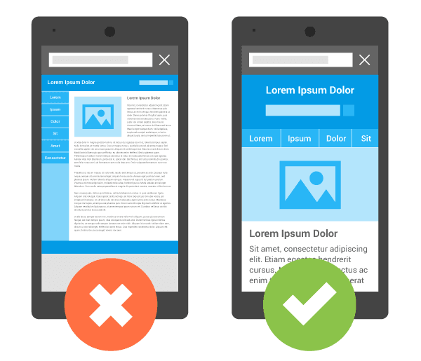
When a business develops its website, the design is often based on the assumption that users will browse it on a desktop computer. Then, the website is modified to adapt to other devices, including smartphones and tablets. In other words, the site is scaled down. This approach is widely known as “graceful degradation” or “desktop-first.” Unfortunately, many visual aspects and features of a “desktop-first” website usually adapt poorly to mobile devices, hence the need for a “mobile-first” approach.
Mobile-first describes a build strategy in which a website is designed for smaller screens first, and then scaled up from there — more features and content are added for bigger and bigger screens. It is also known as “progressive enhancement” and was first outlined in 2009 by Luke Wroblewski.
On the other side, the term “responsive web design” describes a technique in which a website’s design is optimized to automatically adjust to the size of users’ screens. The design, content, and user interface of the website is adapted so that visitors can seamlessly visit it on any device and any browser without hiccups.

Now, when you first create your website, you don’t have to choose between a mobile-first or responsive design. Instead, the former is actually a design strategy while the latter is the result of a technical approach. However, to achieve a great mobile experience for your website, it’s important to understand how these two approaches work.
OPTIMIZING WEBSITE MOBILE EXPERIENCE
From understanding the basics, let’s get to how to actually optimize your website’s mobile experience for performance in search.
1. Design for “the finger”
You’d agree that mobile users mostly navigate their devices’ screens with their fingers, instead of precision-friendly mouse pointers; so you’d want to ensure that your design is “finger-friendly.” Put differently, design for touch!

Accidental and inaccurate taps are common on smaller screens and can be annoying. Users want to be able to scroll and tap with ease. They don’t want to pinch too much or zoom in to tap on something or fill out a form.
2. Create fluid layouts
For the best experience, your website should be able to adjust to the user’s screen size. But the fact is, there are simply too many screen sizes out there to decide which ones to design for. So the best approach is to create a layout that adapts as seamlessly as possible to all of them, which is what fluid layouts help you do.
A fluid layout (also called liquid layout) uses relative units of measurement (percentages) instead of fixed units such as pixels.
As you might expect, this affords greater malleability and fluidity. More plainly, by setting a percentage, you won’t have to think about device size or screen width, and consequently, you can find a reasonable solution for each use case because your design’s size will adapt to the size of the device used.
3. Use compression tools
Compression tools can greatly enhance your website functionality and help you optimize the same for an awesome mobile experience.
Here are some options for you:
- Image compressor — for reducing the size of your .jpeg and .png files while still keeping the quality intact
- Script compressors such as HTML minifier or Gzip compressor — for automatically removing unnecessary comments, whitespace, or code
- CSS minifiers and CSS compressors — for linking together CSS code and improving performance.
4. Go for speed
Ever played the racing video game, Need for Speed? It’s time to apply the same fleetness to your website!

Users expect you to deliver a fast, frictionless mobile experience. And those expectations keep rising as more and more users rely on mobile in their micro-moments. So, how fast should your website page load time be? Simple! It needs to be fast enough for your visitors.
But more specifically, two seconds is a good cusp. In a Google Webmaster video, Maile Ohye, states that:
“2 seconds is the threshold for e-commerce website acceptability. At Google, we aim for under a half second.”
Why should you optimize your mobile site’s page speed?
Studies have found that mobile users often do more than a handful of things on their devices — browsing on a browser, using apps, looking at incoming Whatsapp messages, etc.
This accounts for divided attention. In building your website for the mobile user, you need to address this by optimizing it for speed. Why? Because nearly half of users will abandon a website if it isn’t loaded in 2 seconds; and most will never return.
Start by testing your site to see its load time speed.

TESTING FOR MOBILE USABILITY
Testing plays a huge role in mobile experience optimization. Without it, you won’t know where to make changes or improvements. Small SEO Tools runs a pretty handy tool for testing mobile-friendliness. The tool works with Google’s mobile friendly test too, which means you’ll be getting industry standard data.
Additionally, you can dig into Google Search Console to take your mobile-friendly testing to even a higher level.

Google Search Console has a mobile usability reporting system that details problems on a page-by-page level. Using it, you can keep tabs on mobile-related problems throughout the life of your site.
Below are the key technical elements that Google Search Console looks at and reports on:
- Touch elements too close: This is a common usability issue where it is too hard to tap a given element without also hitting the neighboring element.
- Flash usage: Most mobile browsers do not render Flash and, as such, you would want to use more modern technologies.
- Fixed-width viewport: This problem attempts to circumvent mobile design with fixed width pages and is best shelved when a responsive design is adopted.
- Small font size: This is a scaling issue and requires users to pinch the screen to zoom in.
- Viewport not configured: The viewport meta tag helps browsers in scaling a page to suit a specific device.
- Interstitial usage: A full-screen pop-up often represents poor user experience on a mobile device and is something that Google is cracking down on.
- Content not sized to viewport: The page content does not fit the window, and a user has to scroll. This can be fixed with relative rather than fixed widths.
Optimizing your site to get rid of these issues can positively affect your site’s grading by Google, improve rankings, and certainly creates a better experience for mobile users.
CONCLUSION
Mobile greatly affects SEO. But it doesn’t stop there. When mobile users visit a web page that is not optimized for mobile, user experience de-escalates, conversion suffers, and sometimes, the users inadvertently turn away which means loss of sales.
According to a research by Mobify, more than 1.2 billion people access online content via their mobile device and 30 percent of mobile users will abandon a transaction if the experience is not optimized for mobile.
That’s not something you want, right? Quite obviously, the solution is to optimize your website’s mobile experience. We’ve shared with you the things you can do to achieve mobile experience on your website. Next best step is for you to take actions, putting this information to work.
Source
https://smallseotools.com/blog/why-and-how-to-optimize-your-website-for-mobiles
